Case Study
(*13 +)
Contents
What is Stamurai
Why Redesign
Competitive Analysis
Brand Personality
Direction
Gaining Trust
Information
Sitemap
Let’s Start Designing
Wireframes
Styling
Iconography
Final Design
Homepage
Features
About us
Therapy protocol
Extras
Results
Feedback
What is Stamurai ?
Stamurai is a speech therapy app that intends to help people who stutter or stammer learn and practice speech therapy.
In this Case Study, I'll be sharing my detailed process and rationale behind the decisions I made in redesigning the Landing Page of Stamurai, and ultimately increasing the conversion rate and user engagement.
In this Case Study, I'll be sharing my detailed process and rationale behind the decisions I made in redesigning the Landing Page of Stamurai, and ultimately increasing the conversion rate and user engagement.
Why Redesign ?
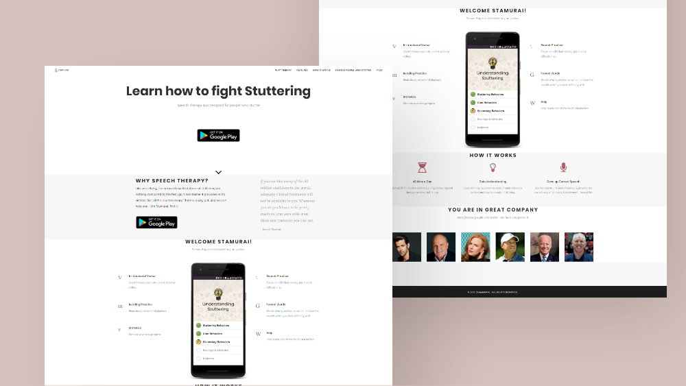
To answer this, let's take a look at the Old landing page design. The old design wasn’t doing well in terms of making sales or in convincing users to download the app. The website had an extremely high bounce rate of nearly 85% with an exceedingly low conversion rate.
REASON FOR THAT ?
To find the answers, I started my research by going through the customer feedback that the app received from their social media platforms and also through the app reviews on PlayStore.
Discovered a common thread among the feedback it received.
And here are some of the main ones :
Discovered a common thread among the feedback it received.
And here are some of the main ones :
-
Users wanted a free trial / asked if there was a free trial.
-
The app seemed to them to be on the expensive side.
-
They had questions and concerns regarding the process of speech therapy the app used.
-
The majority of users didn't find the website helpful.
-
Complains about not being able to access the website via a mobile device. (Website was not mobile responsive, and instead prompted a separate page inviting mobile users to download the app from PlayStore)
-
Users wanted to know more about the app features.
-
A lot of users felt that the website looked shady and cheap, and hence were hesitant about its legitimacy.
COMPETITIVE ANALYSIS
Did a competitive analysis and tried to find out what they were doing better. Hopped onto the actual Stamurai app and decided to try it out for me and get to know how it actually works. Considering how other platforms work, and how it is different.
Key things that I realized after my research, were :
Key things that I realized after my research, were :
-
The need for information.
(We need to talk more about our product, and the way it functions) -
The need for branding and personality.
(Brand personality is important for strengthening a brand, creating loyal consumers, and diversifying from its competition. It also helps with streamlining communication with customers) -
The need for proof.
(Since a lot of users were hesitant to trust Stamurai, we needed to find a way to convince them that they could trust us)
Now, we'll go through them one by one in the exploration phase.
BRAND PERSONALITY
While I was using the app, I realized that Stamurai is not only a speech trainer but also a safe-haven for all its users, as it provides them a community. And so, I felt the need for a congruent color palette to express this welcoming atmosphere.
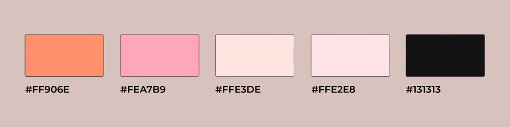
Chose this warm orange color as the primary brand color to show the welcoming and encouraging nature that Stamurai has to all of its users as part of its mission to help people successfully overcome stuttering/stammering.
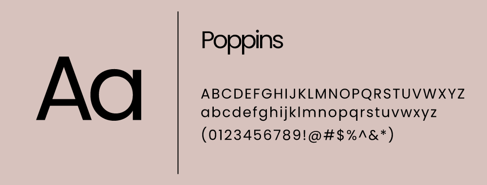
And for the typeface, I chose Poppins, a simple geometric Sans Serif font, that matches with our intent of modern visual appeal with a slight twist of tech.
Direction
When we create landing pages for products or apps, we prefer to showcase the product first and foremost. Though Stamurai was also an app, it was more of a service that it was offering to its users.
So, after discussing it with the PM, we decided to show the outcome of the product as the hero element on the landing page.
But now, how can we do that?
In order to keep the friendly welcoming aspect of the brand, we decided to use playful illustrations representing our concept of communicating an 'outcome'. We brainstormed a few ideas and whittled them down to 3 of those options.
-
A scene related to public speaking.
-
A scene showing a couple on a date.
-
A scene related to a group at a conference.
Gaining Trust
After setting the brand personality, it is time to move on to the next big problem - Gaining the trust of users/visitors.
Stamurai has been featured and endorsed in multiple newspapers, online magazines, and media.
So why not use it as social proof?
Although we've got some complaints and issues from our users, we do have some extremely happy customers too with super positive feedbacks on PlayStore.
So, why don't we add them to the website itself?
This will surely help to reduce the doubts regarding the product's legitimacy.
Information
Yes, now the third part - Talking more about the product, by providing valuable information about it to our users/visitors.
So, let's get back to the problems again.
So, let's get back to the problems again.
-
Users had doubts and questions about the product.And now how can we solve that ?
Let the team answer some of the questions that are both commonly asked and are important, and we can put them into a FAQ section.What if a user does not find their question in the FAQ section, and they still have some doubts?
We can have a live chat option, where we can solve those doubts or issues. -
Users wanted to know more about the Product's features.And now how can we solve that ?
There are quite a lot of features, and adding all of them to the homepage might make the landing page super lengthy and cluttered. So, let's have a section with a preview of some of the features, and we can give the users an option to deep dive into the details, by directing them to a dedicated page for all the app features. -
Users had concerns about the therapy process too.So, ya let's go and solve this too.
Had a quick chat with the PM to know about the process myself, and realized that it definitely needs a dedicated page too. So, let's have a 'How it works' section, with an option to read more about the therapy process on a separate page.
Sitemap
The product team has decided to have a blog running alongside their site, to raise awareness about the issues regarding stammering & stuttering.
This will drive engagement with users regularly too.
So we will add a section with previews of some blogs, and likewise an option to jump over to the blogs directly from the Landing page.
This will drive engagement with users regularly too.
So we will add a section with previews of some blogs, and likewise an option to jump over to the blogs directly from the Landing page.
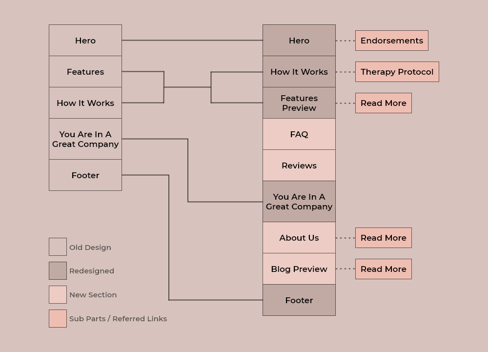
After taking notes from 'Gaining Trust', and tackling issues related to the Information, here's what the new Information Architecture (IA) of the website looks like.
Let's start designing
So, I started off with wireframes and designed a basic layout for the landing page design with respect to the IA we already created.
-
WireframesCreated wireframes for the homepage, based on both desktop & mobile/tablet viewports.
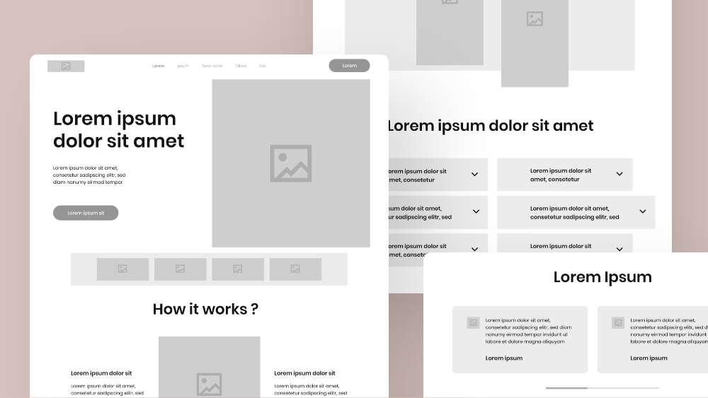
-
StylingSo now, time to add styling to this layout. Will be adding the colors and font styles, as well as the illustrations we discussed in Brand Personality and Direction section.
-
IconographyDecided to add some visual elements, so started sketching some geometric icon shapes with a playful style. And this is what they have turned out to be.
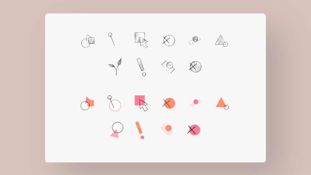
Will be using these elements as icons in some sections, and also to maintain a visual balance throughout the composition.
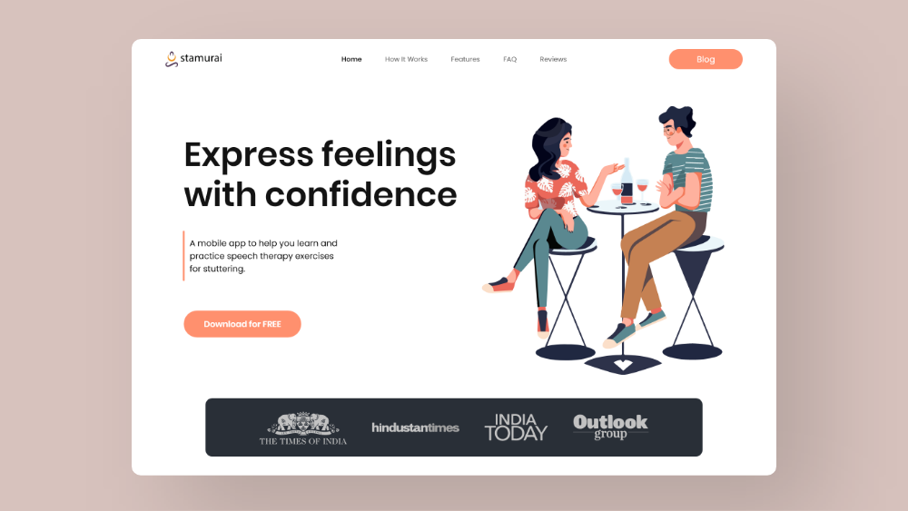
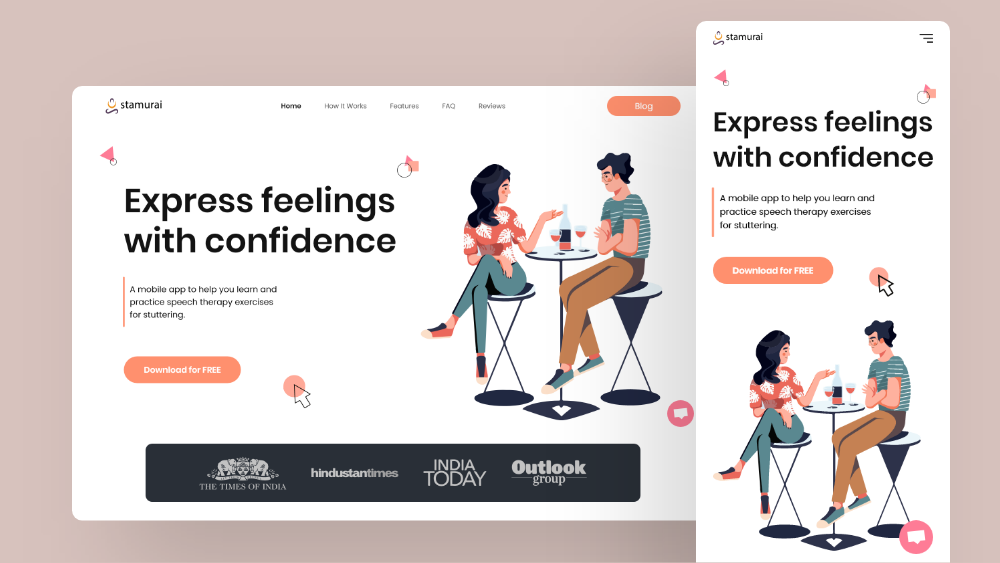
FINAL DESIGNS
So, here comes the first iteration for the Landing page.
After taking notes from 'Gaining Trust', and tackling issues related to the Information, here's what the new Information Architecture (IA) of the website looks like.
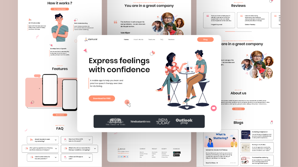
Let me walk you through all the designs related to each section.
-
Hero section
-
Secondary CTA that opens the Blog page.
-
Live chat option.
-
A panel showcasing the logos of companies and brands that have featured and endorsed Stamurai.
-
Primary CTA for Downloading the app.
-
Reorganized menu, that links to different sections of the landing page.
-
Design elements used to bring visual balance to the composition.
-
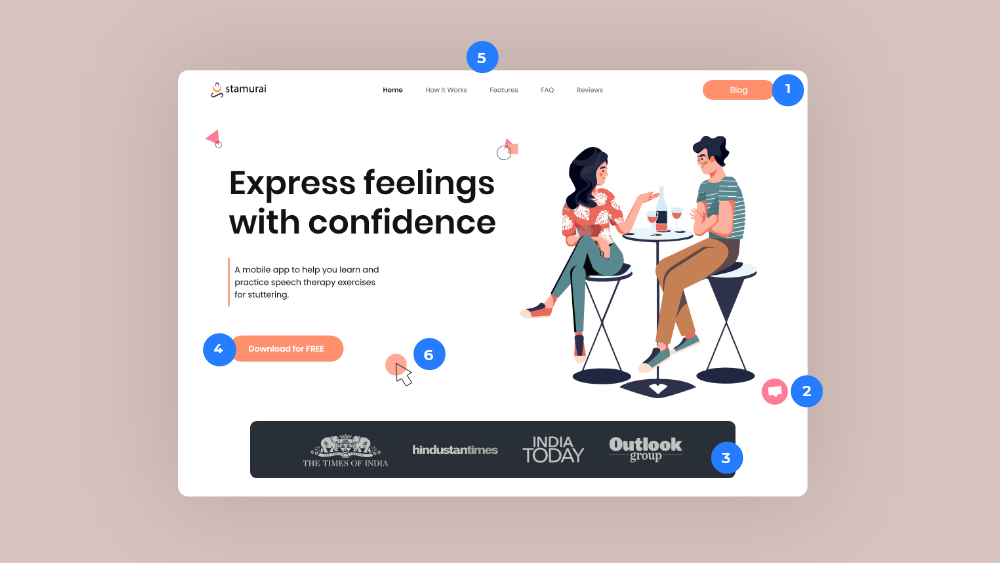
Do you recall the 'outcome' illustrations, that we had a plan for the hero section? Here are the 3 finalized illustrations for that.
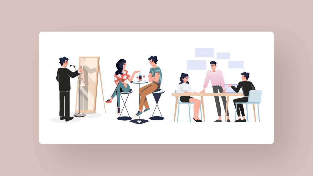
Decided to show all the illustrations in a slideshow, along with a separate heading copy for each of the hero screens.
-
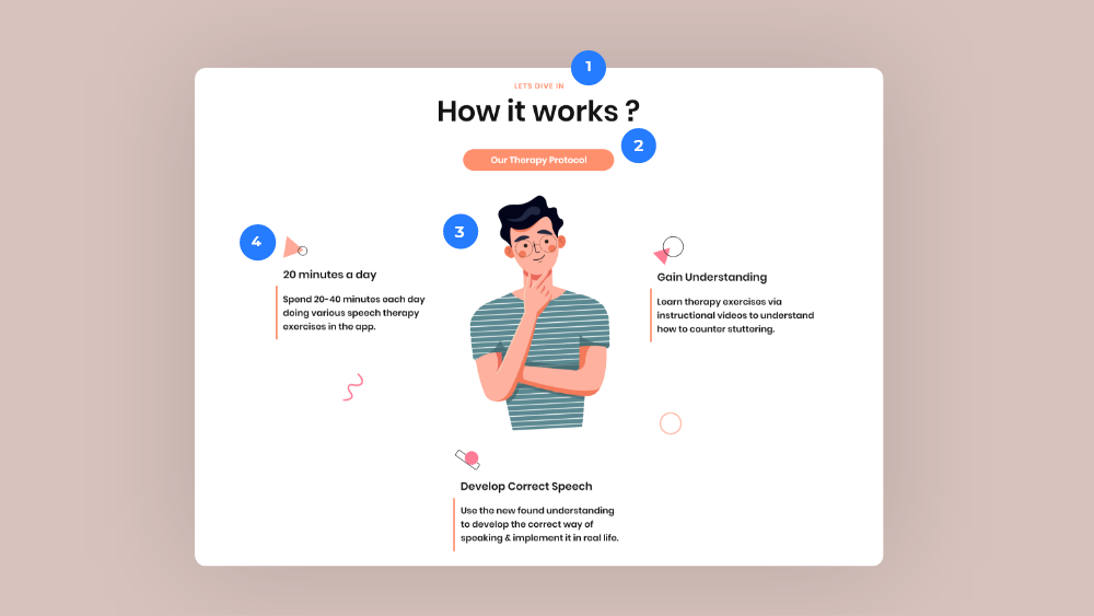
How it works
-
Using a sub-title over the main Heading copy, to emphasize the content of each section.
-
Secondary CTA that opens the dedicated page for Therapy Protocol.
-
Following the same design direction for the illustrations.
-
Used those design elements as icons for categorizing.
-
-
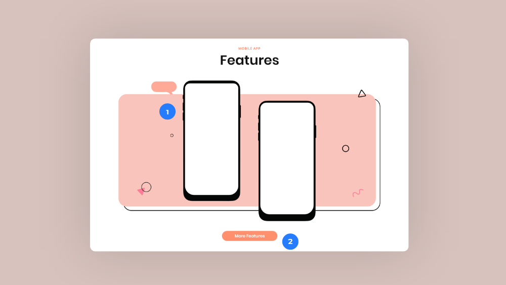
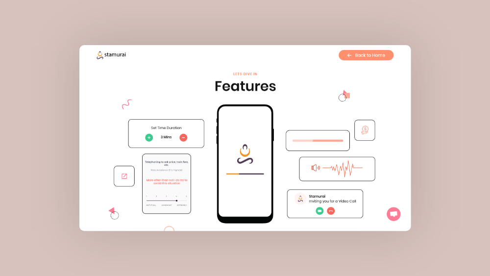
Features
-
Created a placeholder for showing the features in the app screen itself. (A separate team was working on the app)
-
Secondary CTA that opens the dedicated page for Features.
-
-
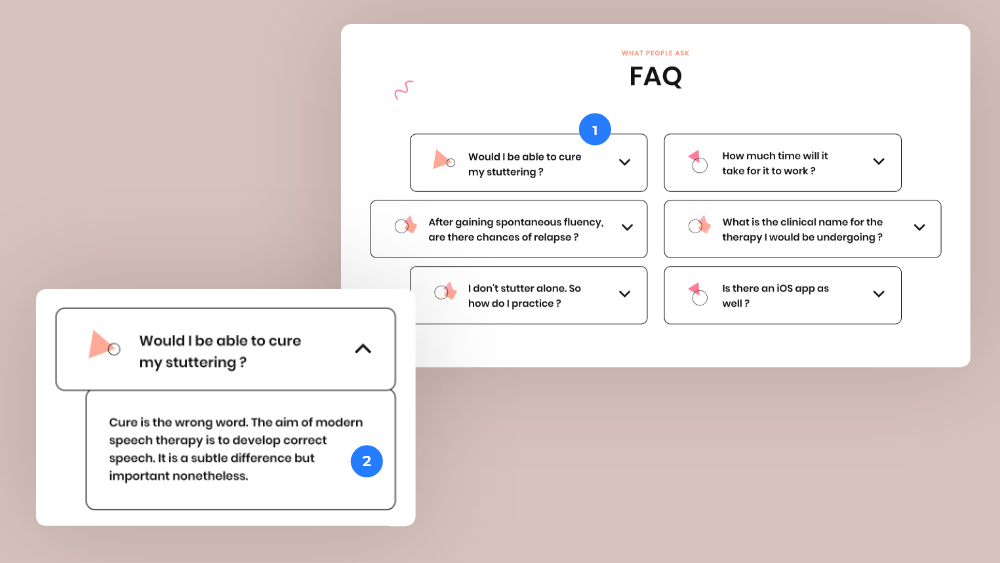
FAQ
-
Simple drop-down for frequently asked questions.
-
Showing the answer to a question.
-
-
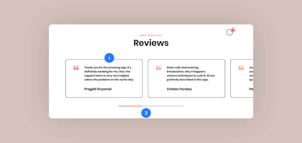
Reviews
-
User reviews of the app from PlayStore.
-
A draggable horizontal section containing the user reviews.
-
-
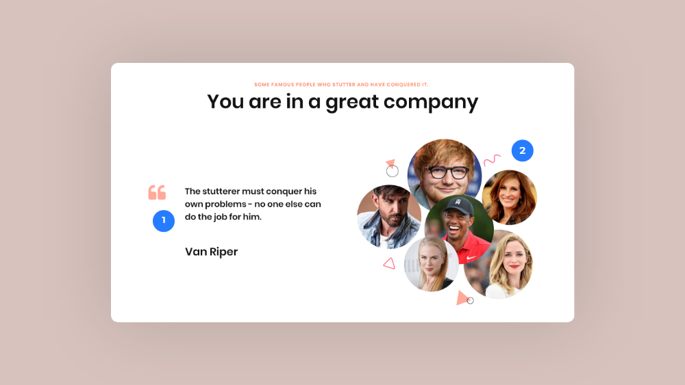
You are in a great company
-
Redesigned the profile presentation of the celebrities who stutter.
-
Added more emphasis to the quote.
-
-
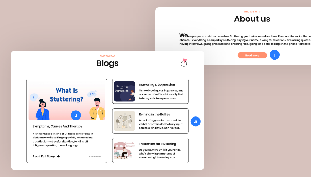
About us & Blogs
-
Secondary CTA that opens the dedicated page for About us.
-
Showing the latest blog in a preview, along with a link to read the full blog, with reading time included as well.
-
Showing a few more blogs raising awareness about myths related to stammering and stuttering.
-
-
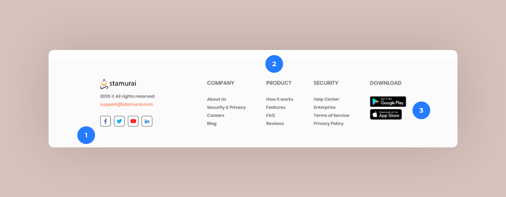
Footer
-
Contact details with social media links.
-
Categorizing the whole sitemap into the 'Company', 'Product', and 'Security' columns.
-
Adding both the links to Google PlayStore and Apple AppStore. (The dev team started working on the iOS app)
-
So now that the homepage was done, we had to design the features, the about us, and the therapy protocol pages.
-
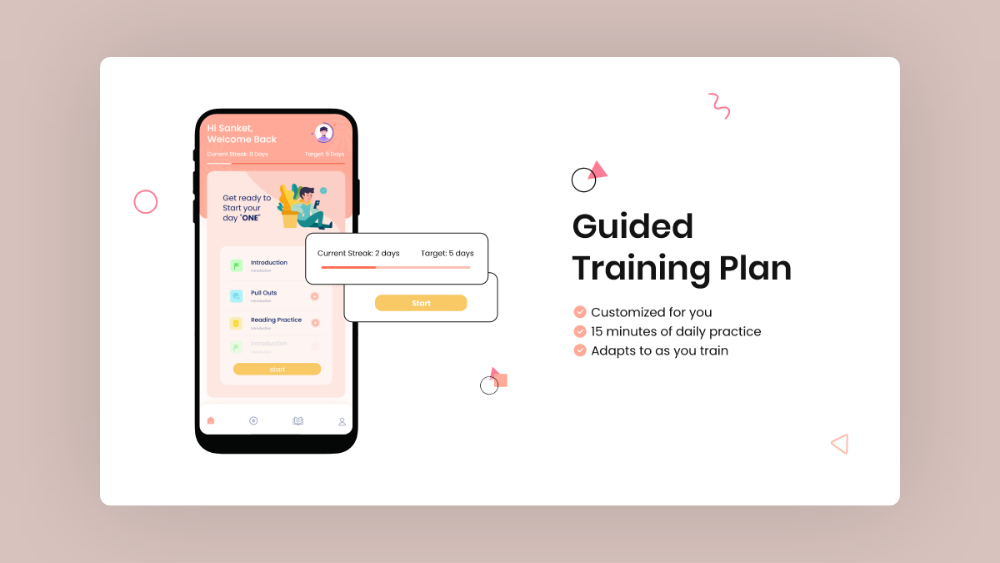
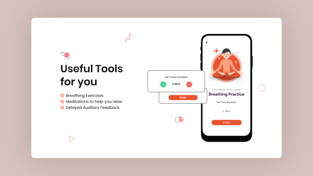
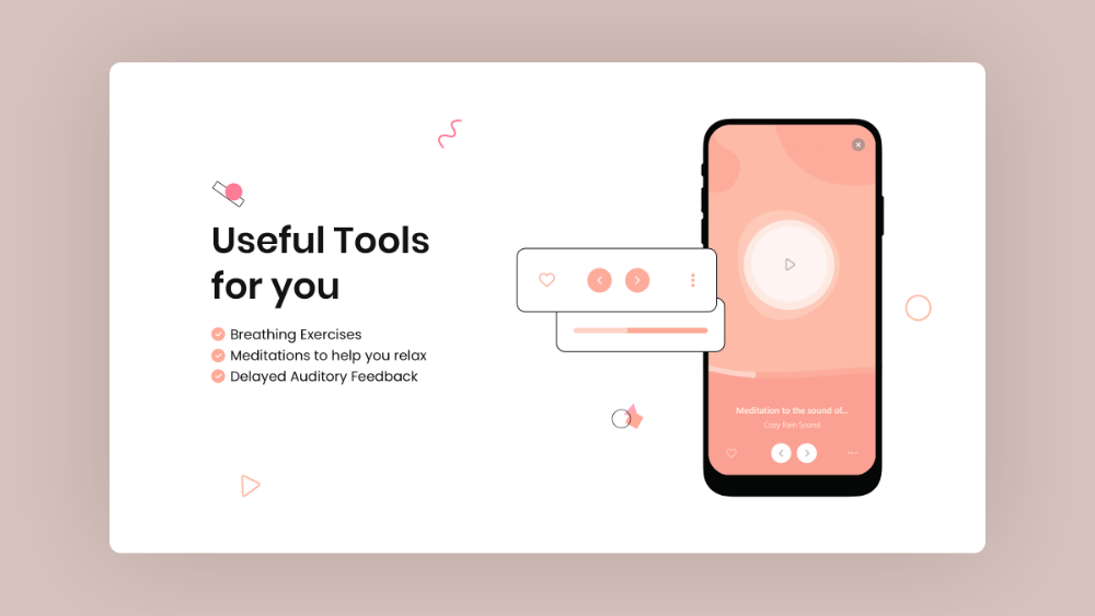
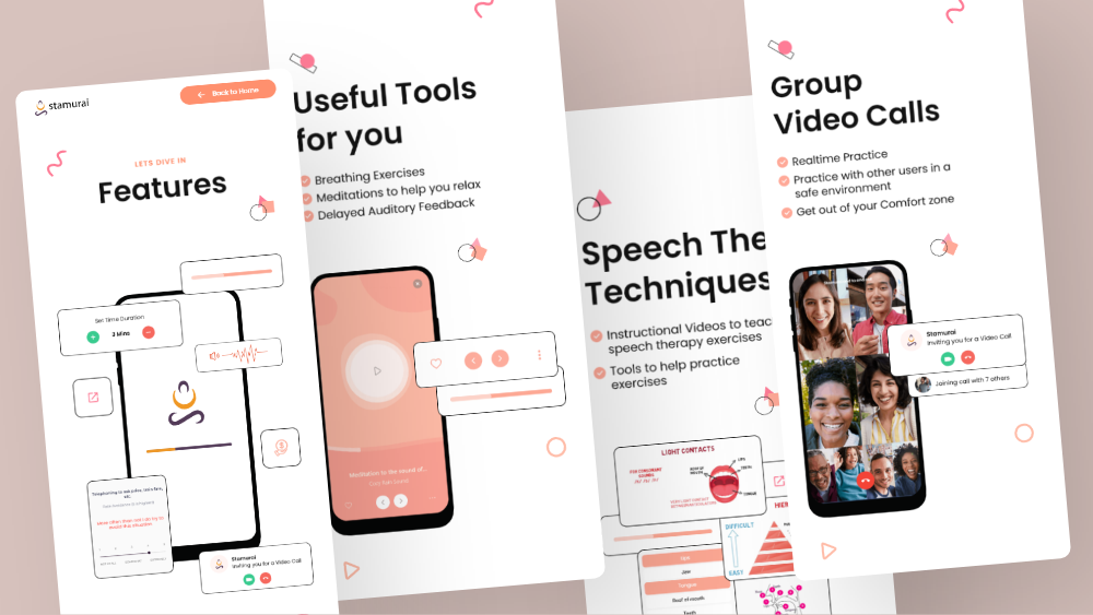
Features pageThe ‘Features’ page showcased the most important features of the Stamurai app. And, so as the first step, we organized the features, and divided them into 5 sections.
-
Guided Training plan
-
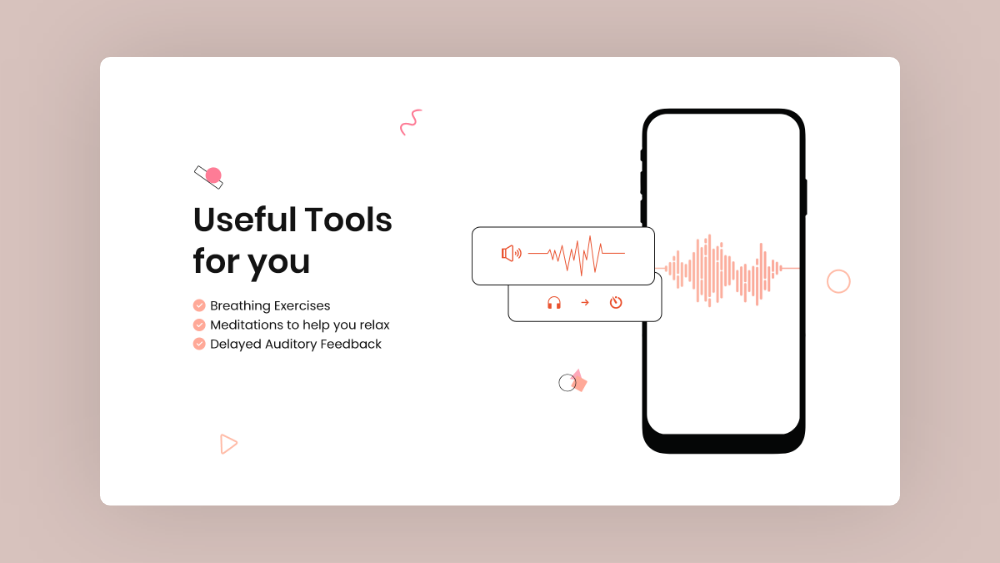
Useful tools
-
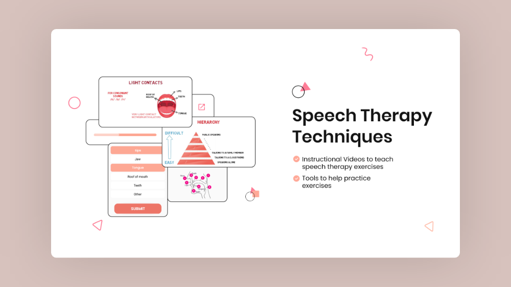
Speech Therapy techniques
-
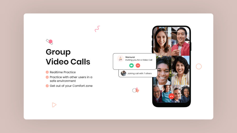
Group video calls
-
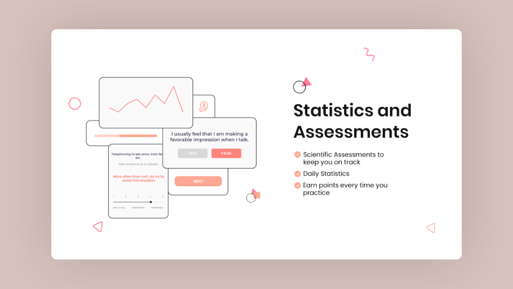
Stats & Assessments
-
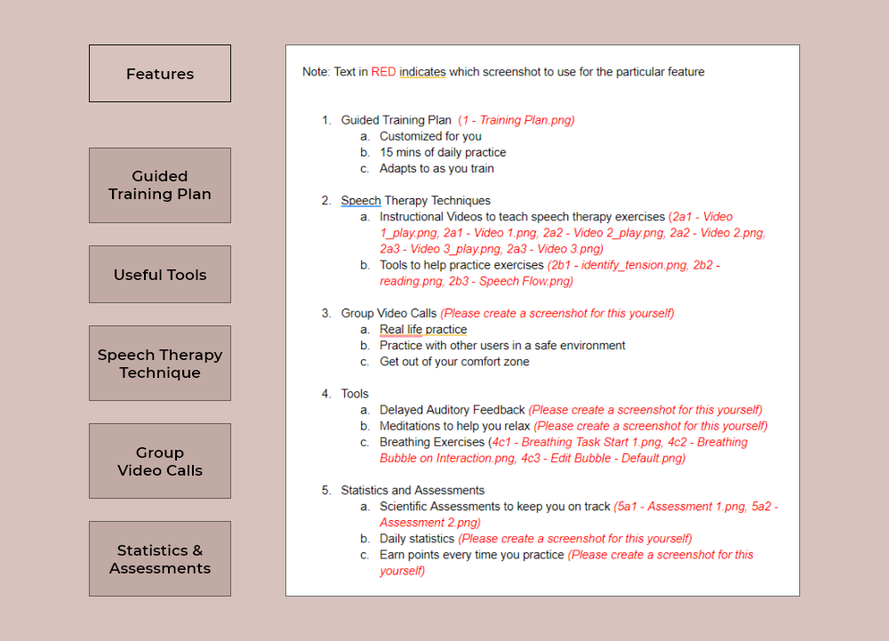
Used the same direction, to design the whole page. Added interactive visual elements from the app, along with some app snapshots for each feature, throughout the page.
And this is how the Features page turned out.
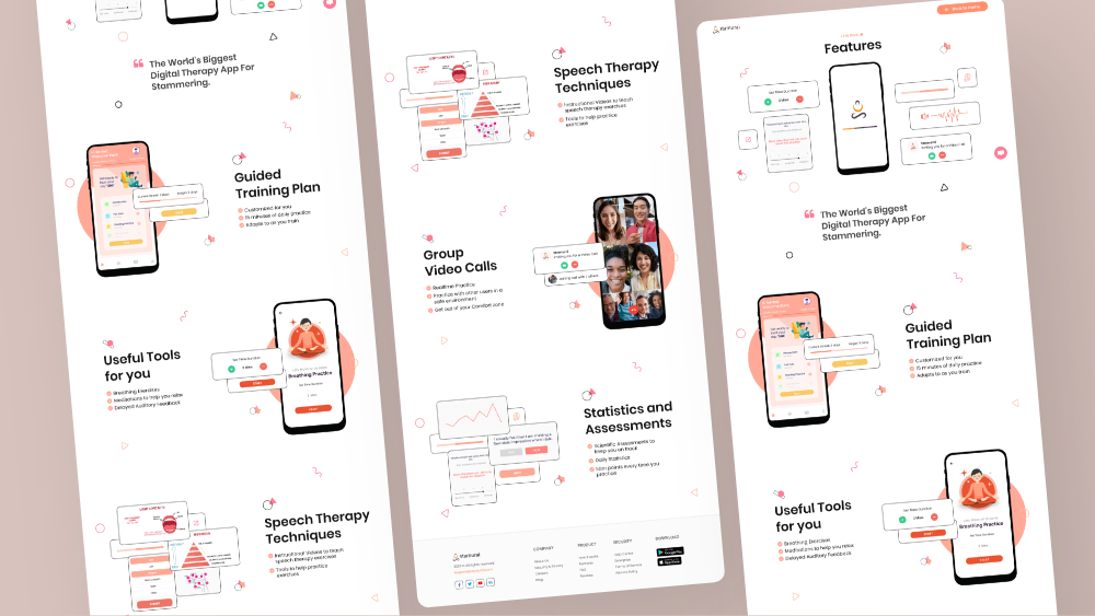
Let me show you all the different sections of the ‘Features’ page that were designed highlighting the various features.
And here’s how the same designs looked like in different mobile & tablet viewports.
-
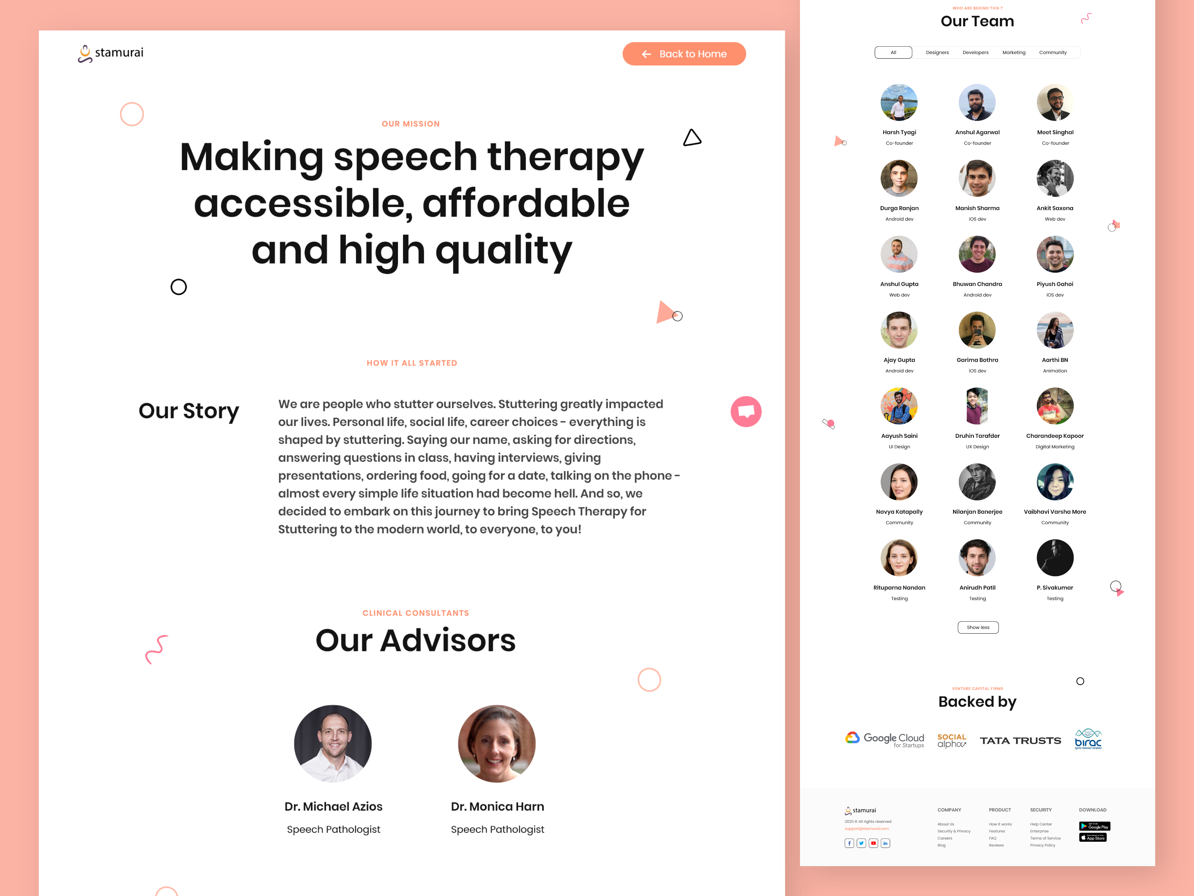
About us pageWe divided the 'About Us' section into three sections, starting with the Mission statement & story, followed by team members & advisors, and lastly investors. A filter option was designed for team members, sorting by Developers, Designers, Marketing, and Community members. And the rest of the page followed the same style direction.
-
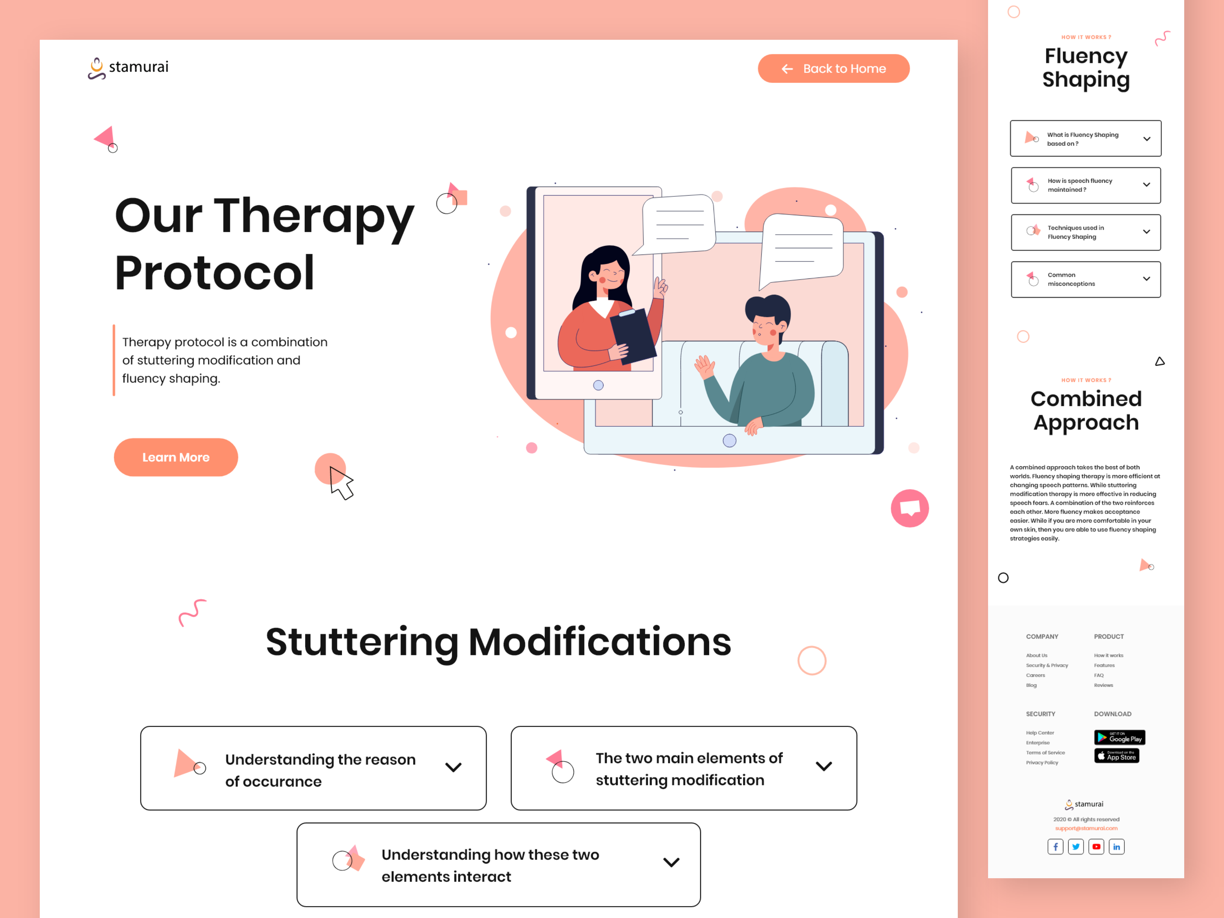
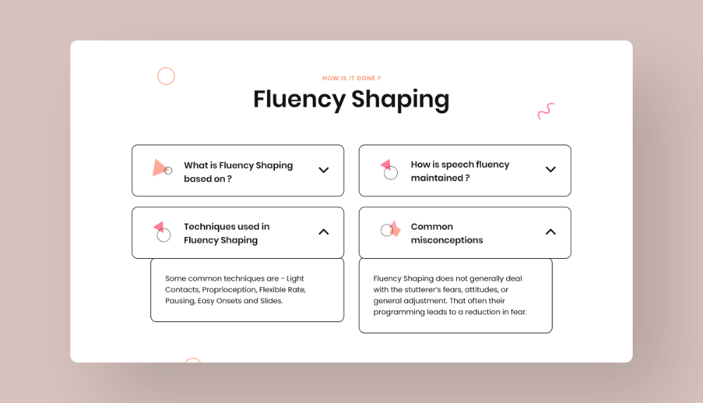
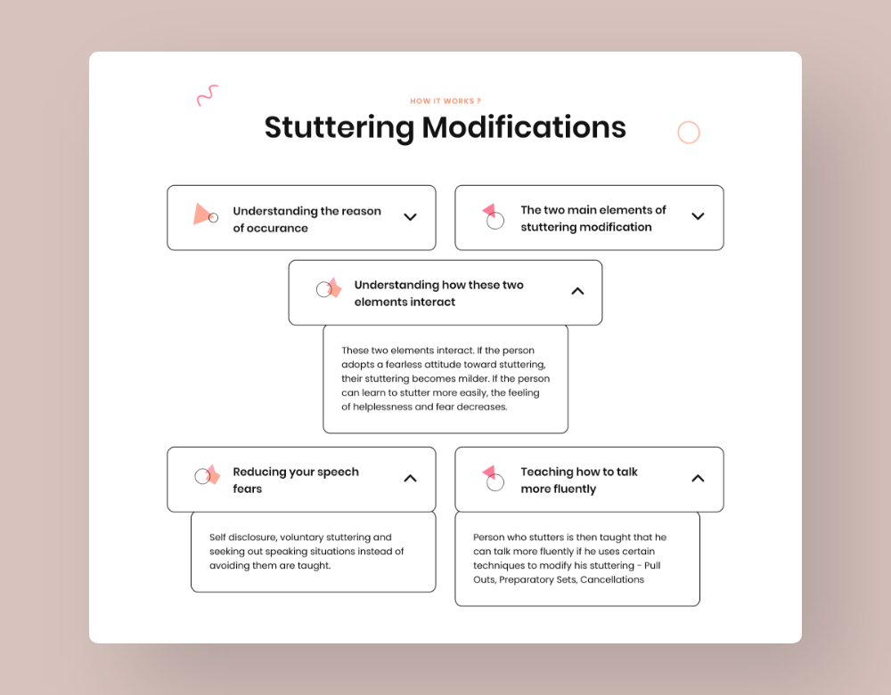
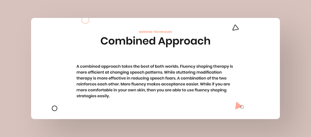
Therapy protocol pageThis page was solely designed to explain to visitors about our efficient approach behind the speech therapy used in the Stamurai app. The page was divided into 3 sections, educating about the Stuttering Modification, Fluency Shaping, and Our Approach. Interactive Q&A elements were designed to explain complicated therapy concepts in a simple and playful way.
Extras
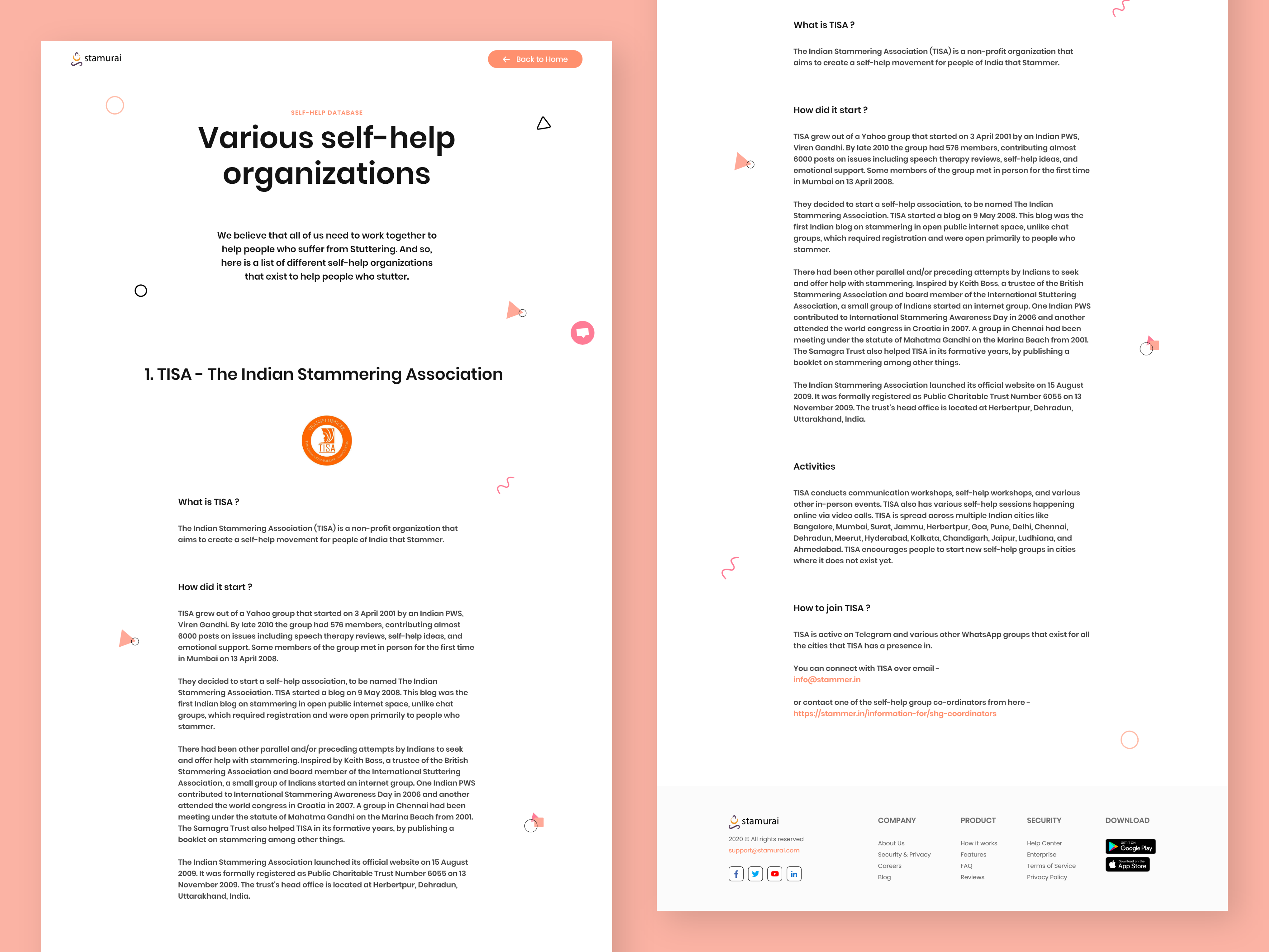
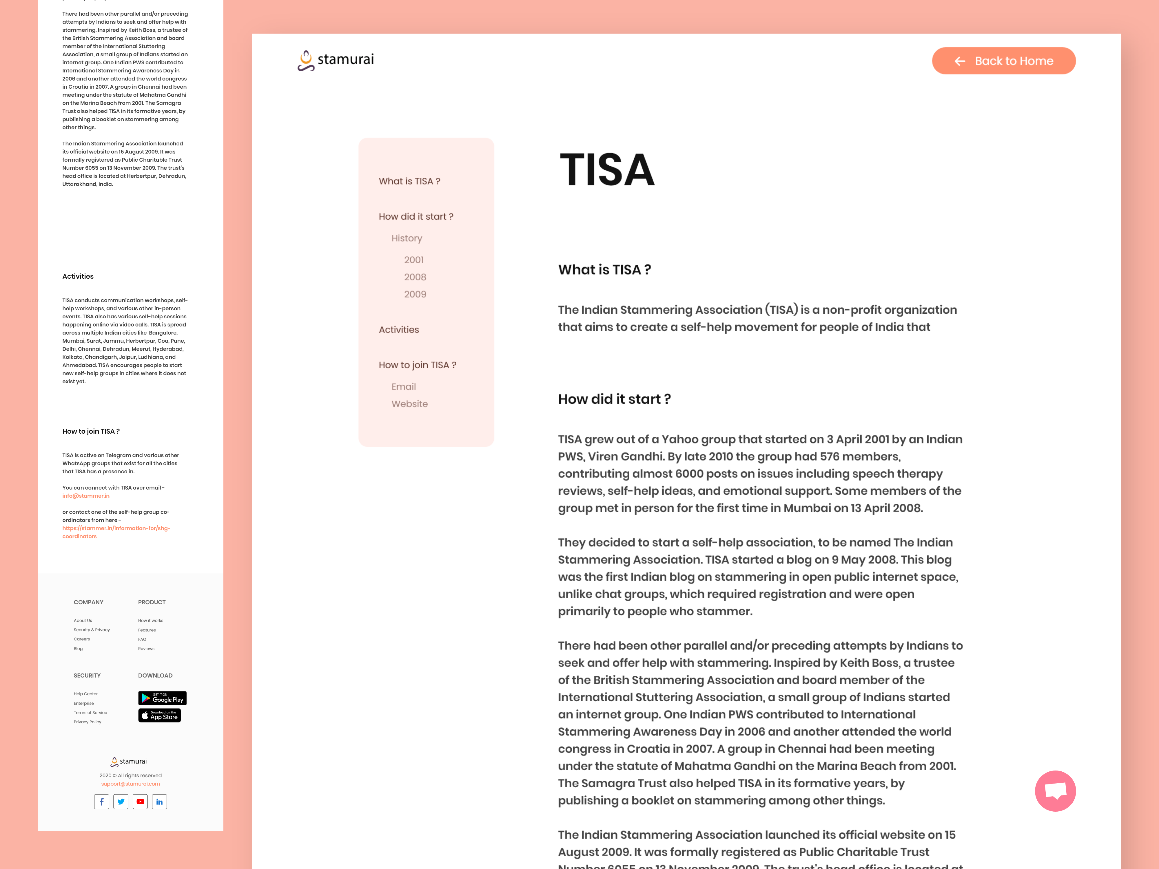
Stamurai isn't just an app that provides speech therapy, but a movement that strives to create a healthy life for people suffering from stuttering by educating them and spreading awareness. They believe we need to work together as a team to achieve this movement's success. And so, we decided to dedicate a whole page listing various self-help organizations working towards the same goal.
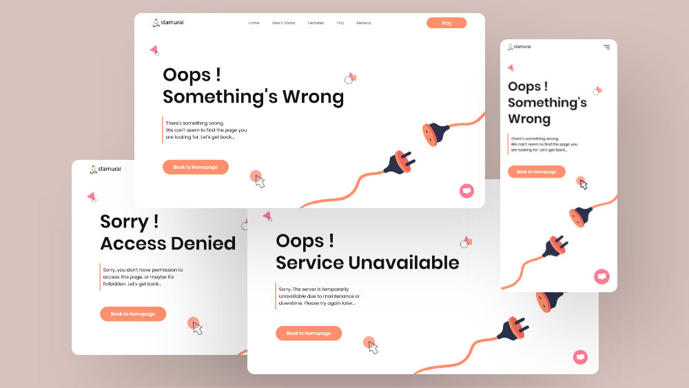
After completing all the self-help org pages, we designed different error pages. And here are a few of the examples showing 404, 403 & 503 error pages.
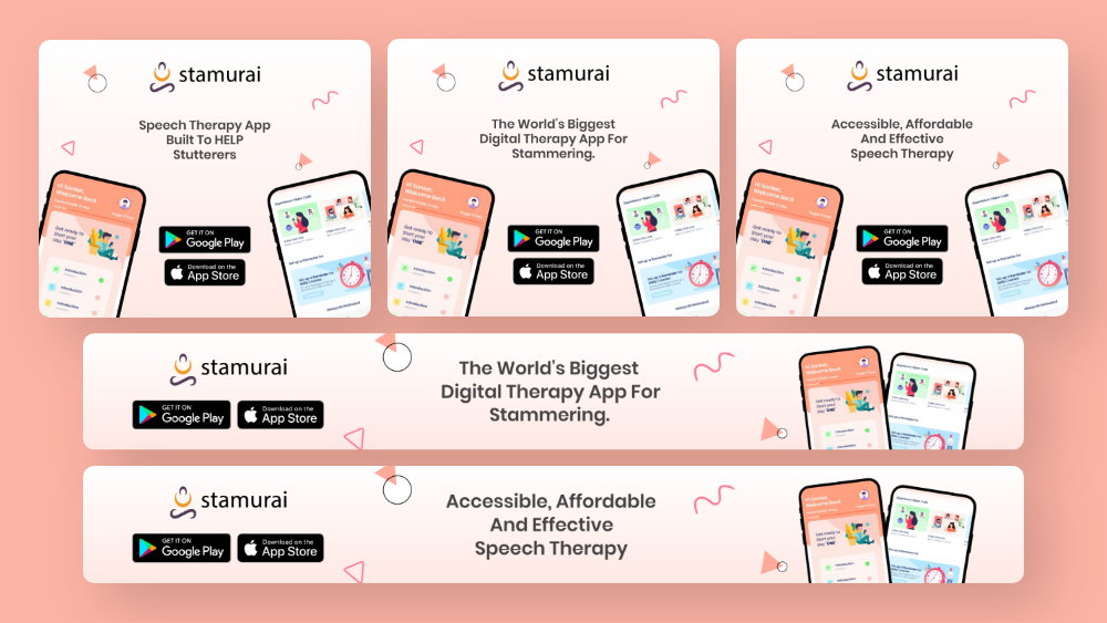
While designing the ‘Features’ page, I worked on a few web advert banners too, designed with the same visual elements and visual style, and here are a few of them. These web banners were later added to Stamurai's Blog pages.
Results
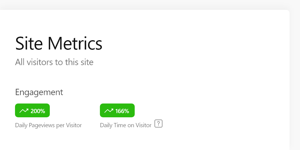
Both the development and design teams worked simultaneously. And our efforts to redesign the site actually resulted in an improvement in User engagement, as the user engagement increased by 166% while the page bounce rate decreased to nearly 8% from 85% within 3 months.
Along with that, our marketing team helped us exceed our growth goal which saw a 200% increase in organic page views within the same time period. We saw an overall growth in conversions too, and now the Stamurai app is live with more than 70k downloads in PlayStore.
Along with that, our marketing team helped us exceed our growth goal which saw a 200% increase in organic page views within the same time period. We saw an overall growth in conversions too, and now the Stamurai app is live with more than 70k downloads in PlayStore.
Feedback
" Druhin worked with us as a UI / UX Designer for the Stamurai website. I found him to be skilled in multiple domains - UI, UX, Animations, UX Writing and Front-end Development.
His ability to grasp complexities of a project is breathtaking. I remember giving him a complicated brief in just a Word document, and seeing a near perfect design 4 days later! No back and forth involved.
We still get compliments on the beautiful designs provided by Druhin from multiple quarters. Given his young age, I can only imagine the heights Druhin will reach in the years to come."
Meet Singhal
co-founder, stamurai
Info
Website
Stamurai.com
Timeline
Apr - Jul ‘20
tools
Adobe XD
Adobe Illustrator
Protopie
Adobe After Effects
Zeplin
Notion
Adobe Illustrator
Protopie
Adobe After Effects
Zeplin
Notion
discipline
UI/UX Design
UX Research
UI Animation
UX Research
UI Animation
Contact
(*7 +)